
Listen
Hear about the goals, challenges and priorities of the Raising Voices website with the founder.

Learn
Conduct background research on the site structure and the structure of similar nonprofits.

Analyze
Analyze content and structure and rethink site navigation

Create
Create site map and test questions.

Test
Test sitemap navigation with tree tests and first click tests
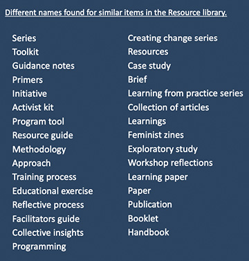 Content labels used on website
Thirty one different names were used to label content within the resource library. Many names were similar and/or interchangeable. This naming convention prevented similar content items to be grouped, making search and retrieval more cumbersome for users.
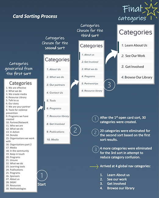
Three different card sorts, interspersed with analysis and revision, were performed with users to arrive at a streamlined architecture. The last test shrank the global navigation to four categories. Task success improved, but more clarification was still needed.
 Content labels used on website
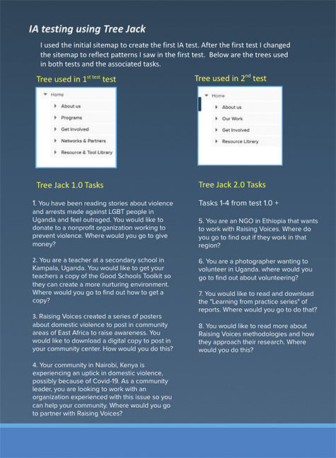 Navigations used on the first and second tree tests
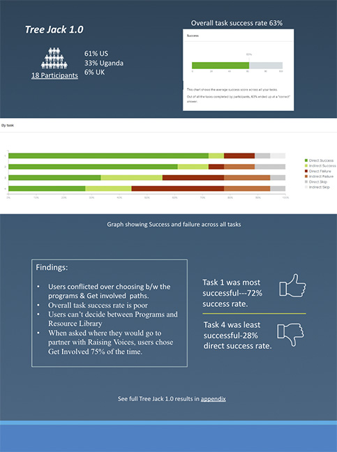 Successes and failures from the first tree test
Because staff mentioned that finding the SASA! toolkit was a frequent user action, I used it as a tree test scenario to gauge the architecture's success. Even after several changes and iterations, the task only had an 18% success rate with the existing architecture. More revisions and testing needed to be done.